


Buffett, Bubbles, and the Warning No One Wants to Hear
Stand back, folks. This could get ugly.
The biggest super bubble in history is about to explode – I’m calling it…
…in the next 45 days or less.
Write this down on your calendar so you can either anoint me as the dumbest guy you know or the “smart dude who predicted the super bubble crash of 2025.”
I’m feeling pretty good here as history is on my side…just saying.
So, where should we start?
How about with the Warren Buffett Indicator…
…this week (July 21st – July 25th) it just hit an all-time high of roughly 208%.
In review, the Buffett Indicator is the ratio of the total market capitalization of U.S. stocks to U.S. GDP. And when it gets frothy…well, let’s just say it ain’t good.
My main man Buffett has said that anytime this indicator approaches 200%, investors are “playing with fire.”
For context, the Buffett Indicator was less than 80% before the dot-com crash in 2000 and around 100% before the 2008 crash – as Buffett would say – this indicator “is probably the single best measure of where valuations stand,” and right now it’s at a level never seen before in history.
If you want further evidence of just how uneasy Buffett is feeling right now about the market – he’s sitting on a record amount of cash – over $347 billion worth, to be exact.
Hmm. Sounds like “smart money” to me.
In fact, lots of market indicators are “flashing red” right now.
But if you listen to the market “go-roos” on CNBC and other financial media outlets – the market is just getting warmed up and we’re going “TO THE MOON!”
These blowhards are so blatantly biased and misinformed by their own warped narratives and dopamine market melt-up sugar high that they’ve lost all common sense.
Because if you look hard enough, you can always find ONE data point to support YOUR narrative and that’s exactly how most of these major financial outlets roll.
Not me. I’m taking the opposite view, one that looks back at history – because I know that both ‘success and failure’ leave clues.
Moving on…
Another time-tested valuation metric for you to be aware of is Robert Shiller’s Cyclically Adjusted Price/Earnings (CAPE) ratio – based on the average inflation-adjusted earnings from the previous 10 years.
As of July 21, 2025, it’s at 38.45.
This is roughly double its historical average (16-20) and places today’s market in the 97th percentile of valuations on record. In fact, only two periods in U.S. history have seen a higher CAPE: the 1929 pre-crash boom (CAPE ~32 at the peak) and the 1999 dot-com mania (CAPE peaked at ~44). Even the 2007 market pre-financial crisis was substantially cheaper at ~27 than it is now.
Yikes!
Let’s move on and look at yet another indicator – the equity risk premium – which is the extra return investors demand over risk-free bonds…which today has dwindled to levels that imply complacency.
For example, one gauge to measure here is the “Excess CAPE Yield” (earnings yield minus 10-year Treasury yield.) In July 2025, this stood at just 1.38%, which if far below the long-term average of about 4-5% (meaning stocks are offering very little reward for this much extra risk.)
Even John Hussman, known for his stock market crash predictions, notes that when projected equity returns are this low (or negative) and valuations are stretched, the market is…
…” overvalued, overbought, and over-bullish” …
…exactly like the triple threat warning that also preceded both the 2000 & 2008 market collapses.
“If you can look into the seeds of time, and say which grain will grow and which will not, speak then unto me.”
– William Shakespeare, Macbeth
The Breaking Point is At the Margin
Booming asset prices entice greedy investors who gleefully take on leverage – borrowing money to buy even more stocks…” The sky’s the limit!”
And did you know that speculative leverage in the U.S. stock market is now at historic highs?
In fact, margin debt has skyrocketed over the past year and hit an all-time record of $937 billion back in January 2025.
This means investors are more leveraged now than even during the 2000 or 2007 bubble peaks (and in those times, margin debt was significantly lower in absolute terms and as a percentage of GDP).
It’s the classic example of the Greater Fool Theory.
The Greater Fool Theory is a speculative investment strategy where investors buy overvalued assets, hoping to resell them at a higher price to a “greater fool” who will pay even more for it later.
…That’s exactly what’s happening in the market right now…the “fools” are all in!
Add margin to this equation and it becomes the ultimate “Dunce Indicator.”
Yeah, that’s a new macroeconomic indicator that I made up!
Once the Dunce Indicator is flashing red, the market is essentially standing on a pile of dry tinder (investor leverage) that can easily supercharge any “spark” into a full-fledged conflagration (that’s just a fancy word for a BIG A$$ FIRE!)
We are at the peak of market insanity, where extreme bullish leverage has eroded the foundational pillars that hold this market up.
As economist Hyman Minsky famously observed, stability breeds instability…
…we’ve entered the dreaded “Minsky Moment,” – after years of easy money and rising stocks, investors’ confidence has turned into complacency, excessive leverage, and irrational exuberance – all it takes now is a modest prick, and this ginormous balloon is going to pop.
The “Minsky Moment” is a sudden, significant collapse of asset values and marks the “end of the growth cycle.”
I think ALL asset classes are in a bubble – real estate, crypto, financial markets, consumer – corporate – government debt, you name it.
Another useful macro indicator, the Leading Economic Index (LEI) compiled by The Conference Board, has been steadily deteriorating – consistent with an economy on the brink of collapse.
By mid-2025, the LEI had fallen for 15 consecutive months – an unusual streak only seen prior to past recessions (notably the great recession of 2008, when it fell 18 months straight right before the crash).
Want more convincing?
Here’s some additional things to think about:
- Today’s market breadth is alarmingly narrow. The “Magnificent 7” mega-cap tech stocks (Apple, Microsoft, Google, Amazon, Nvidia, Tesla & Meta) have driven a disproportionate amount over overall market gains.
- Consumer debt has recently reached a new all-time high and now exceeds $18.2 trillion.
- Mortgage & Auto Loan delinquencies saw the largest increases in May 2025 – a strong indication that borrowers are demonstrating early signs of financial stress.
- I could go on and on here, but since I greatly value your time and attention, we will stop right here…but there is one more scary chart I do need to share with you below.
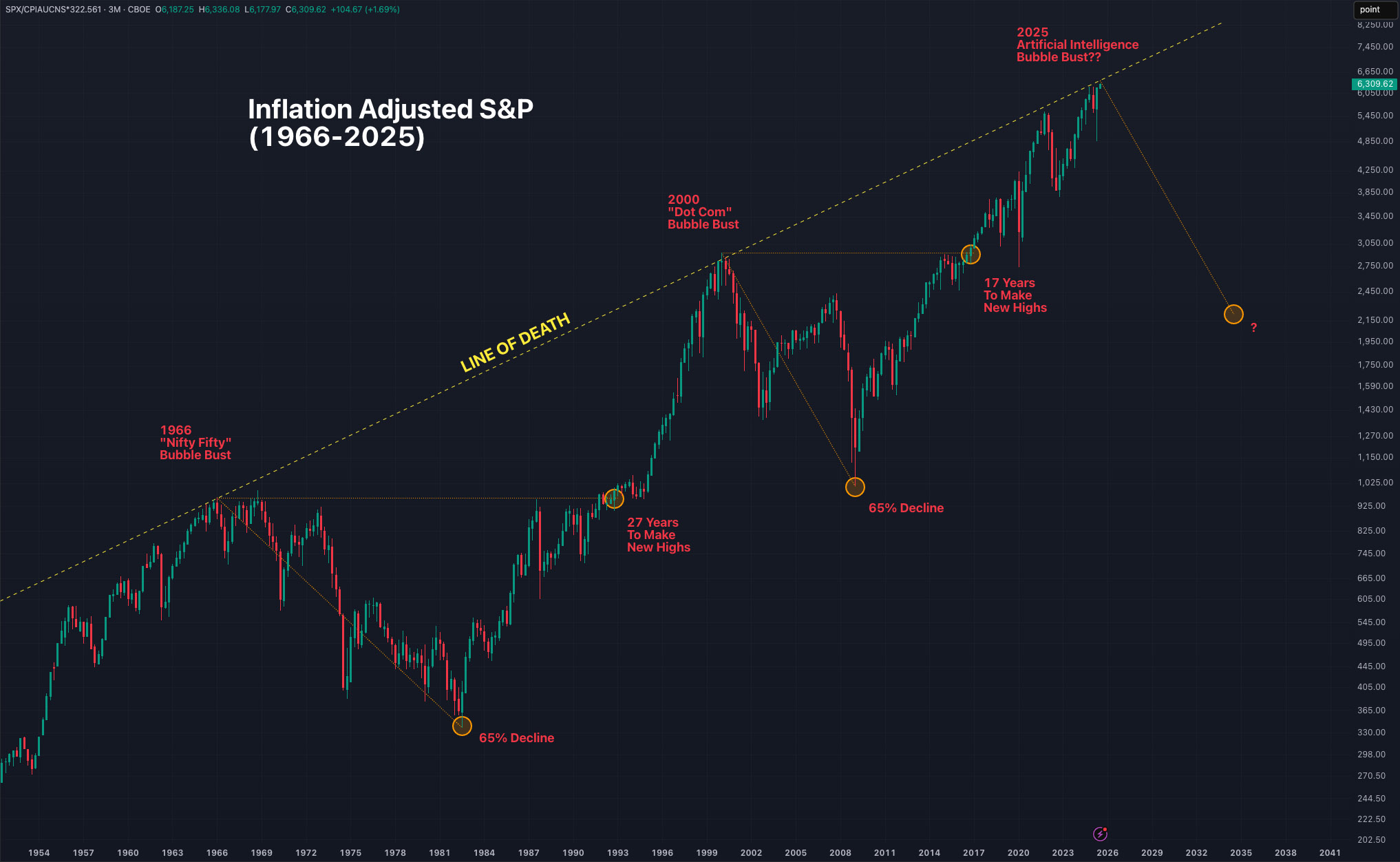
And Drum Roll Please…Stocks Just Hit the “Line of Death”
In his Q2 letter to investors on July 15, veteran investor Bill Smead shared a rather ominous chart displaying inflation-adjusted S&P 500 returns since the 1960s.
In recent weeks, the market has hit the dreaded “line of death” for only the third time since 1960 as the S&P continues to surge to all-time highs around 6,300.
So where do we go from here?
Hell, if I know!
But I do want you fine folks out there to keep your eyes and ears wide open as this is not a time to be “risk-on” IMHO – there are just too many red flags to ignore IF you’re paying attention.
But what about the A.I. REVOLUTION that’s going to 100X productivity and profits?
I’ll save that discussion for another time…
…just know this…
…the A.I. Revolution is going to replace 40% of the workforce in the next 2 years…
…that means millions of people will be out of jobs, have no money to spend, and won’t consume the goods and services that the “productivity advances” bring in the first place. (But you don’t hear anyone really talking about that.)
Like mania periods from the past, this one is all about A.I. – but lost in the hype is the implications of the technology.
It’s perhaps the perfect paradox and fitting end to our story, because as they say…
…you reap what you sow.
Stay unruly out there and follow your muse